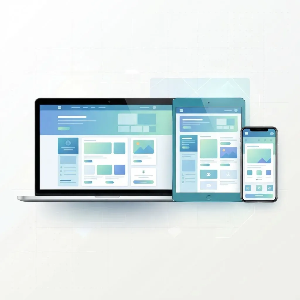
Discover the best web application development services for mobile-responsive design, what to look for in a partner, and how responsive apps win users in 2026.
Last updated: July 22, 2026
Introduction
More than six in ten web visits now happen on a phone, yet many web applications still feel like desktop software squeezed onto a smaller screen. That gap is exactly why mobile-responsive web application development has become the deciding factor between apps people love and apps they abandon. A responsive application does not simply shrink to fit a device; it reshapes its layout, navigation, and interactions so the experience feels native everywhere.
This guide explains what separates the best web application development services for responsive design in 2026, the technical foundations that make an app truly adaptive, and a practical framework for choosing a development partner. Whether you are launching a SaaS product, an internal dashboard, or a customer portal, the principles here will help you invest in an application that performs on every screen.
Table of Contents
- Why mobile-responsive design defines modern web apps
- What "responsive" really means in 2026
- Core capabilities the best development services offer
- The technical foundations of a responsive web app
- How to evaluate a web application development partner
- Responsive design mistakes that cost you users
- A practical build checklist
- Frequently asked questions
- Conclusion
Why Mobile-Responsive Design Defines Modern Web Apps
Responsiveness is no longer a bonus feature; it is the baseline users expect. Google's mobile-first indexing means the mobile version of your application is the version search engines evaluate, so poor responsive behavior directly limits your visibility. Beyond rankings, responsiveness shapes conversion. A checkout form that misaligns on a phone, a table that forces horizontal scrolling, or a button too small to tap all quietly push users away.
There is also an efficiency argument. Building one responsive codebase that adapts fluidly is far cheaper to maintain than separate desktop and mobile products. The best development services understand this and design once for a spectrum of devices rather than for two or three fixed breakpoints.
What "Responsive" Really Means in 2026
Early responsive design was mostly about media queries that snapped layouts at set widths. Today the definition is broader and more sophisticated.
Fluid, content-aware layouts
Modern responsive apps rely on flexible grids, container queries, and intrinsic sizing so components respond to the space they occupy rather than the size of the whole viewport. A card can rearrange itself based on its own container, which makes design systems far more reusable.
Adaptive interaction models
Responsiveness now includes how people interact. Touch targets, gesture support, hover alternatives, and on-screen keyboards all change between devices. A great app respects those differences instead of assuming a mouse and keyboard.
Performance as a design constraint
A responsive layout that loads slowly on a mid-range phone is not truly responsive. Core Web Vitals, image optimization, and code splitting are now part of the responsive conversation, not separate concerns.
Core Capabilities the Best Development Services Offer
When comparing providers, look past the portfolio gloss and evaluate the capabilities that produce durable, adaptive applications.
Full-stack expertise
Responsive behavior is not only a front-end concern. Data needs to load efficiently, APIs must return device-appropriate payloads, and rendering strategy affects perceived speed. Strong teams pair polished interfaces with solid architecture. WebPeak, for example, offers both dedicated front-end web development and back-end web development so the visible layer and the engine behind it are built to work together.
Modern framework fluency
Frameworks like React and Next.js make responsive, high-performance apps far easier to build and maintain through component reuse, server rendering, and image optimization. Teams with deep React JS web development and Next JS web development experience can deliver interfaces that stay fast as they scale.
Design and engineering under one roof
The smoothest projects happen when interface design and development are tightly connected. A provider offering integrated website design alongside engineering reduces the handoff friction that so often breaks responsive layouts.
Ongoing support
Devices, browsers, and operating systems change constantly. Providers that include website maintenance and support keep your app responsive long after launch.
The Technical Foundations of a Responsive Web App
Understanding the building blocks helps you ask sharper questions and judge answers.
Mobile-first CSS
Mobile-first means designing the smallest screen first and progressively enhancing for larger ones. This keeps the core experience lean and forces teams to prioritize essential content.
Flexible media and typography
Images should scale with modern formats such as WebP or AVIF and use responsive loading so phones never download desktop-sized files. Fluid typography that scales with the viewport keeps text readable without manual breakpoints.
Semantic, accessible markup
Accessibility and responsiveness reinforce each other. Semantic HTML, proper heading order, and sufficient tap-target sizes benefit every user and align with search guidelines.
Rendering strategy
Server-side rendering and static generation improve first paint on slower connections, while client-side interactivity handles rich behavior. The best teams choose the right blend for each screen rather than defaulting to one approach. For data-heavy products, robust web application development practices ensure the interface stays responsive even under load.
How to Evaluate a Web Application Development Partner
Use these criteria to separate genuine experts from vendors who merely claim responsiveness.
- Ask for live examples on your own phone. Load their past work on the same mid-range device your customers use, not a flagship. Watch how quickly it responds.
- Review their testing process. Reliable teams test across real devices and browsers, not just a resized desktop window.
- Check performance evidence. Request Core Web Vitals or Lighthouse scores for shipped projects.
- Understand their design system approach. Reusable components signal maturity and long-term maintainability.
- Clarify post-launch ownership. Confirm who handles updates, bug fixes, and browser changes.
A partner offering broad web development and complementary mobile app development can also advise when a responsive web app is enough and when a dedicated native app is worth the investment.
Experience, Expertise, and Trust in Practice
Choosing a development service is ultimately an act of trust, and the best providers earn it by demonstrating real experience rather than describing it. Ask to speak with a past client who launched a product similar to yours, and listen for how the team handled the difficult moments: a performance regression on older devices, a redesign mid-project, or an unexpected surge in traffic. Teams that have genuinely shipped responsive applications talk in specifics, not slogans.
Expertise also shows up in how a partner explains trade-offs. A trustworthy team will tell you when a feature is not worth the complexity, when a native app would serve you better than a responsive web app, or when your budget is better spent on performance than on visual polish. That candor is a strong signal that they are optimizing for your outcome rather than the invoice. Combined with clear documentation and transparent progress updates, it turns a vendor relationship into a genuine partnership.
Real-World Example: A Responsive Dashboard Rebuild
Consider a common scenario: a company has an internal analytics dashboard built years ago for desktop only. Sales reps increasingly need it on tablets and phones in the field, but the current version forces endless pinch-zooming and horizontal scrolling. A capable development service would not simply shrink the existing screens. Instead, they would rethink the information hierarchy for small screens first, surface the two or three metrics reps actually check on the go, and defer heavier tables behind clear navigation.
They would replace fixed-width tables with card layouts on narrow screens, introduce touch-friendly filters, and lazy-load charts so the first meaningful view appears quickly even on a weak signal. The result is not a smaller desktop app but a genuinely mobile-first experience that still expands gracefully on large monitors. This is the difference between resizing and true responsive engineering, and it is exactly the judgment you are paying an experienced partner to provide.
Responsive Design Mistakes That Cost You Users
Even capable teams stumble on avoidable errors. Watch for these.
- Hidden content on mobile. Removing information rather than reorganizing it frustrates users and hurts SEO.
- Tiny or crowded tap targets. Buttons and links need enough space for a thumb.
- Fixed-width elements. A single hard-coded width can break an entire layout on small screens.
- Ignoring landscape and tablets. The gap between phone and desktop is where many designs fall apart.
- Overloading the first screen. Cramming everything above the fold hurts clarity and load time.
A Practical Build Checklist
Before you sign off on a responsive web application, confirm the essentials:
- The layout adapts smoothly across phones, tablets, and desktops with no horizontal scroll.
- Text remains readable without zooming, and tap targets are comfortably sized.
- Images use modern formats and load appropriately for each device.
- Core Web Vitals pass on a representative mid-range phone.
- Forms, menus, and interactive elements work with touch, keyboard, and screen readers.
- The design uses reusable components so future changes stay consistent.
Frequently Asked Questions
What is the difference between responsive and adaptive design?
Responsive design uses fluid layouts that flex continuously across screen sizes, while adaptive design serves distinct fixed layouts at specific breakpoints. Most modern apps favor a responsive, fluid approach because it handles the huge variety of devices more gracefully.
Do I need a native app or is a responsive web app enough?
For many products, a well-built responsive web app delivers an excellent mobile experience without the cost of separate native apps. Native still wins for heavy offline use, deep hardware access, or app-store distribution. A good development partner will help you weigh the trade-offs.
How long does it take to build a responsive web application?
Timelines vary with complexity, but a focused product typically takes a few months from design to launch. Reusable component systems and clear requirements shorten the process significantly.
Does responsive design affect SEO?
Yes. Google uses mobile-first indexing, so your mobile experience directly influences rankings. Fast, accessible, responsive apps tend to rank better and convert more visitors.
How much does mobile-responsive web application development cost?
Cost depends on features, integrations, and scale. Rather than choosing the cheapest quote, focus on value: performance, maintainability, and support usually matter more than the initial price.
Conclusion
Mobile-responsive web application development is no longer optional; it is the foundation of how modern users judge your product. The best development services combine fluid, content-aware layouts with strong architecture, modern frameworks, rigorous testing, and dependable support. When those pieces come together, your application feels effortless on every device and stays that way as technology evolves.
If you are ready to build an application that performs beautifully across every screen, explore WebPeak's website design and front-end web development services, or talk to the ZoneTechify team about your next web application project. Start with a clear responsive strategy today and give your users an experience they will return to.